Today’s post is gonna be the start of a new series diving into the details of creating nice[r] plots with Python. As I already mentioned in a similar post last year, this collection is also a helpful reminder for me whenever I look up the same things again and again.
One particular thing which always drives me crazy is adjusting panels in somewhat more complicated plots using Python’s subplots. However, recently I found an extremely useful function simplifying this a lot: pyplot.subplot_mosaic ! This function allows us to create really exotic configurations of panels just by sketching what we want directly in Python. What else could we wish for!?
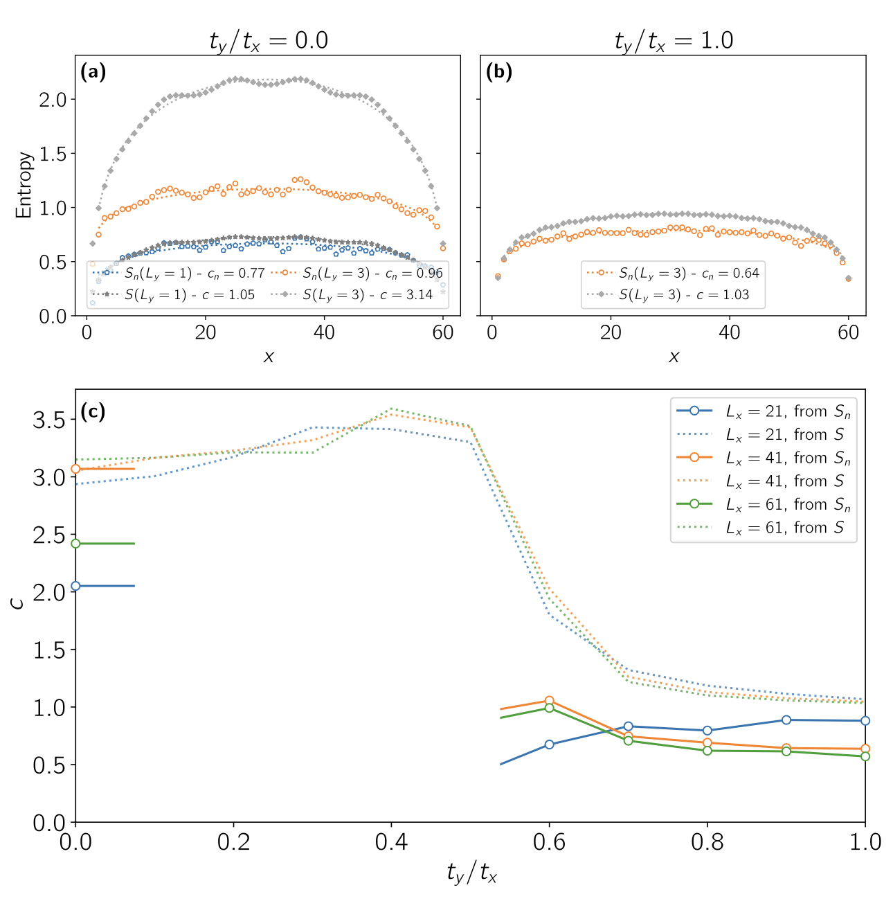
Instead of going through a step-by-step guide essentially repeating the documentation, I had another idea: Why not recreate a plot I published in a paper some time ago – and maybe polish it a bit further along the way. Our starting point is the plot on the right. To be honest, this is by far not the nicest plot I ever created and it definitely can be improved a lot (as I did for my PhD thesis…).
However, our focus shall be on using subplot_mosaic and only improving some things for a slightly simplified version of this figure. So let’s get started!
So let’s compare the final version to the initial one:


Yes, I know, the new version is lacking some identifying (a‑c)’s, but for a solution exclusively using Python without any polishing in Inkscape I’m pretty happy with the result.
What are your secrets for creating nice, consistent plots? Any special functions you use?