Pyplot: Different scales for normalized colorbars
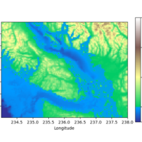
When visualizing two-dimensional data sets, certain types of heatmaps are often useful. In many such cases, there is some reasonable „center“ of the colormap. For example for a topographic map indicating elevations the sea level is often such a baseline. However, mountains often have a larger elevation range than water has depth range. In such cases, it might be useful to use different linear scales on both sides of the center value.
In this post, I’ll discuss how to create plots like these with Python’s Matplotlib using code examples derived from the Matplotlib documentation. In particular, I’ll comment on a weird version-dependent behavior differing for Matplotlib 3.4 and 3.5. weiterlesen…