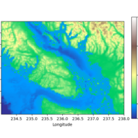
Pyplot: subplot_mosaic

One par­ti­cu­lar thing which always dri­ves me cra­zy is adjus­ting panels in some­what more com­pli­ca­ted plots using Python’s sub­plots. Howe­ver, recent­ly I found an extre­me­ly useful func­tion sim­pli­fy­ing this a lot: pyplot.subplot_mosaic ! This func­tion allows us to crea­te real­ly exo­tic con­fi­gu­ra­ti­ons of panels just by sket­ching what we want direct­ly in Python. What else could we wish for!? wei­ter­le­sen…

Pyplot: Different scales for normalized colorbars

When visua­li­zing two-dimen­sio­nal data sets, cer­tain types of heat­maps are often useful. In many such cases, the­re is some reasonable „cen­ter“ of the color­map. For exam­p­le for a topo­gra­phic map indi­ca­ting ele­va­tions the sea level is often such a base­line. Howe­ver, moun­ta­ins often have a lar­ger ele­va­ti­on ran­ge than water has depth ran­ge. In such cases, it might be useful to use dif­fe­rent line­ar sca­les on both sides of the cen­ter value.

In this post, I’ll dis­cuss how to crea­te plots like the­se with Python’s Mat­plot­lib using code examp­les deri­ved from the Mat­plot­lib docu­men­ta­ti­on. In par­ti­cu­lar, I’ll com­ment on a weird ver­si­on-depen­dent beha­vi­or dif­fe­ring for Mat­plot­lib 3.4 and 3.5. wei­ter­le­sen…