Der Beitrag diese Woche ist gewissermaßen eine öffentliche Notiz für mich selbst.
Beim Erstellen von Abbildungen für meine Arbeit schaue ich oft die selben Dinge wieder und wieder nach. Deshalb habe ich mir gedacht, dass es sich vielleicht lohnt, solche Dinge hier zu sammeln.
Schöner Nebeneffekt: wenn mich jemand fragt, wie etwas davon funktioniert, kann ich ihn oder sie direkt hier hin schicken. Weil allerdings die Leute, die mich sowas fragen, eher Englisch als Deutsch sprechen, werde ich diese Art von Beiträgen auf Englisch schreiben.
Visualizing two-dimensional data sets can be quite hard, especially if not only qualitative but also quantitative features should be clearly captured. Often, a nice way around is to plot some kind of „heatmap“ visualizing numerical values at certain points by different colors. For example, many topographic maps indicating the elevation do exactly this.
In many such cases, there is some reasonable „center“ of the colorbar. For example for a topographic map indicating elevations the sea level is often such a baseline. However, mountains often have a larger elevation range than water has depth range. In such cases, it might be useful to use different linear scales on both sides of the center value.
In this post, I’ll discuss how to create plots like these with Python’s Matplotlib using code examples derived from the Matplotlib documentation. In particular, I’ll comment on a weird version-dependent behavior differing for Matplotlib 3.4 and 3.5.
I tried to make this post as self contained as possible. Therefore, I first present the Python commands used step by step, while the complete code can be found here.
If you’ve never used Matplotlib before, I recommend having a look at the whole toolkit – it’s really amazing how simple it is to generate nice figures with Matplotlib!
Loading the example data
Before visualizing any data, we first have to load it. We’ll be using some example data included with the standard Matplotlib installation:
import matplotlib.cbook as cbook

# Load the example data
dem = cbook.get_sample_data('topobathy.npz', np_load=True)

# Compute elevations in meters instead of feet
topo = dem['topo']*0.3048

longitude = dem['longitude']
latitude = dem['latitude']
Creating the colormap
Next, we will create our colormap based on the included terrain colormap:
import numpy as np
import matplotlib.colors as colors
import matplotlib.pyplot as plt

colors_undersea = plt.cm.terrain(np.linspace(0, 0.17, 256))
colors_land = plt.cm.terrain(np.linspace(0.25, 1, 256))
all_colors = np.vstack((colors_undersea, colors_land))
terrain_map = colors.LinearSegmentedColormap.from_list('terrain_map', all_colors)
Based on this, we could now go ahead and plot our first topographic map:
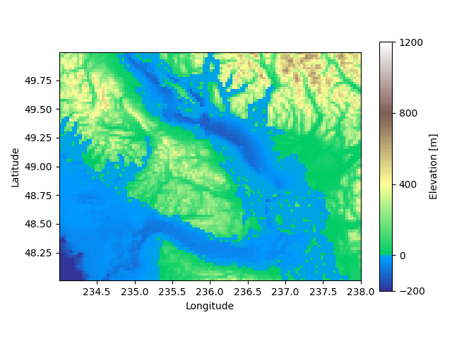
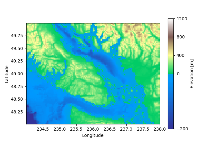
# Plot our map
pcm = plt.pcolormesh(longitude, latitude, topo, rasterized=True,
                     cmap=terrain_map, shading='auto')

# Create a colorbar
cb = plt.colorbar(pcm, shrink=0.8)
cb.set_ticks([-200, 0, 400, 800, 1200])
cb.set_label('Elevation [m]')

# Set aspect ratio because distance between lines of longitude depends on latitude.
plt.gca().set_aspect(1 / np.cos(np.deg2rad(49)))

plt.show()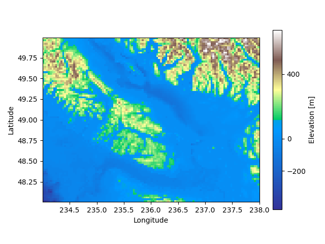
While this gives already a nice first plot, note the weird position of the center of the colorbar. Right now, it is not centered at 0 m but somewhere around 50 m. This is definitely not what we want, so we have to fix this.
Matplotlib’s TwoSlopeNorm
In fact, we can tell Matplotlib to use different linear scales on both sites of a center value using TwoSlopeNorm:
divnorm = colors.TwoSlopeNorm(vmin=-200., vcenter=0, vmax=1200.)

# Plot our map and tell Matplotlib to use our new normalized colormap
pcm = plt.pcolormesh(longitude, latitude, topo, rasterized=True,
                     cmap=terrain_map, norm=divnorm, shading='auto')
Doing this, we obtain a nicely centered colorbar and the sunken coasts in our map reappear in vivid green colors:
Matplotlib 3.4.3 vs 3.5.2
Depending on your version of Matplotlib you might obtain one of the above plots. While the technically outdated Matplotlib 3.4.3 gives a nice colorbar which takes into account the different ranges for positive and negative values, the newer version 3.5.2 uses the same scale for both sides.
Until now I couldn’t figure out a way to obtain the (in my opinion much nicer) consistent scale for positive and negative values using Matplotlib 3.5.2. Luckily, you can simply get the older version using pip install matplotlib==3.4.3 before generating your two-sloped colormap and updating again afterwards pip install -U matplotlib.
Thank you for the detailed explanation.
In the new versions, the colorscale is given by the bit-length of each scale. Since both the undersea and land scales have the length 256, the middle is at zero.
By modifying the length to 256*(abs(vmin or vmax)/(vax-vmin) you can keep a linear scale.
Thanks for your comment, that’s indeed good to know!